The legendary handset manufacturer Nokia has announced to change its 60 years old iconic blue color logo with a new refreshing one. The motive behind unveiling a new brand identity is to accelerate market growth.
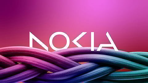
The new logo shows five different geometric shapes that altogether forms the name ‘NOKIA’. The brand-new logo showcases an array of colors according to the use. A shift in branding reflects company’s new ambition in the market of business technology. CEO of the company Pekka Lundmark in his conversation with Reuters said, “Nowadays we are a business technology company,” moreover, he explained that smartphone is not company’s priority any longer.
Hence, the assumption of Nokia’s return to the smartphone market does not seem happening. However, Nokia sells phones under its brand name, which is actually assembled by HMD Global.
In 2020, the firm overtook a Finnish company, and then Lundmark worked upon strategy in three main parts: reset, accelerate & scale, in which first part is particularly achieved and now he is focusing on second.
Nokia’s main focus is on to its business as a service provider with telecom companies. "We had very good 21% growth last year in enterprise, which is currently about 8% of our sales, (or) 2 billion euros ($2.11 billion) roughly," Lundmark said. "We want to take that to double digits as quickly as possible."
Major technological companies in manufacturing sector are joining hands with firms in telecom gear makers like, Nokia for a business for private gears and 5G networks.
