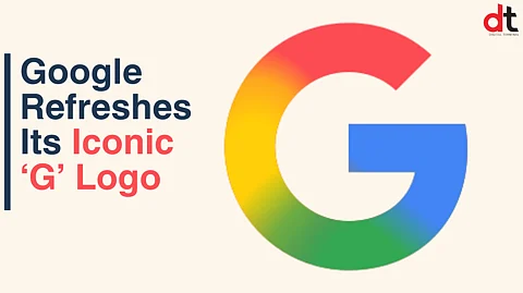

Google has officially unveiled a fresh iteration of its iconic ‘G’ logo, marking the first major visual update in nearly a decade. The redesigned logo embraces a more fluid and dynamic aesthetic, featuring smooth transitions between Google’s signature four colors — red, yellow, green, and blue — in a gradient style that replaces the previously distinct color blocks.
First introduced in 2015 during a comprehensive brand revamp, the circular 'G' symbol has become one of the most recognizable emblems in the digital world. The new design reflects Google's continued evolution, aligning with its modern design language and growing emphasis on artificial intelligence and visual coherence across platforms.
The updated logo has already begun rolling out to users across Google’s ecosystem. iOS users can spot the change in the latest version of the Google Search app, while Android users received the update earlier this week via the Google app beta version 16.18. Despite the refreshed icon, Google’s main six-letter wordmark — introduced alongside the ‘G’ logo in 2015 using the custom Product Sans font — remains unchanged.
While there is no official confirmation yet on whether other Google apps like Chrome, Maps, or Drive will follow suit with similar gradient updates, the move signals a broader shift in Google’s visual identity strategy. Given these apps share the brand’s iconic color scheme, design enhancements may be on the horizon.
In a related update, Google has also rolled out rich text formatting features for its web-based Keep app. Users can now access a formatting toolbar offering headings (H1, H2), regular text options, bold, italics, underline, and a clear formatting tool — bringing greater functionality to note-taking across the platform.
These visual and functional updates reinforce Google’s commitment to both aesthetic refinement and user-centric innovation as it continues to shape the future of digital experiences.
𝐒𝐭𝐚𝐲 𝐢𝐧𝐟𝐨𝐫𝐦𝐞𝐝 𝐰𝐢𝐭𝐡 𝐨𝐮𝐫 𝐥𝐚𝐭𝐞𝐬𝐭 𝐮𝐩𝐝𝐚𝐭𝐞𝐬 𝐛𝐲 𝐣𝐨𝐢𝐧𝐢𝐧𝐠 𝐭𝐡𝐞 WhatsApp Channel now! 👈📲
𝑭𝒐𝒍𝒍𝒐𝒘 𝑶𝒖𝒓 𝑺𝒐𝒄𝒊𝒂𝒍 𝑴𝒆𝒅𝒊𝒂 𝑷𝒂𝒈𝒆𝐬 👉 Facebook, LinkedIn, Twitter, Instagram